
 Blogs
BlogsA Beginner's Guide to CSS Animation
Hey there! Ever wondered how websites make pictures move around, fade in and out, or just look fancy? That's all, thanks to something called animation!
Animation is like adding cool tricks to your website, making it more interesting and fun to look at. The good news? You don't need to be a super-coder to use it. Even beginners can get started with animation.
In this article, we'll break down the basics of animation and show you how it works. We'll use clear and simple language, so even if you're brand new to this, you'll be able to understand it.
Ready to learn how to make your website come alive? Let's dive into the world of animation with something called CSS animations!
Difference Between CSS Animation and CSS Transition
To start, it's important to understand the difference between CSS Animation and CSS Transition.
Think of CSS transitions like mini-makeovers for your website elements. They're great for those smooth changes you see, like a button brightening up when you hover your mouse over it.
CSS animations are like full-on website action movies! You can create awesome, fancy movements with different parts happening one after another. Imagine a picture popping in, spinning around, and then slowly fading away—that's the kind of coolness CSS animations can do!
Let's see a quick example of a CSS Transition.
Now, when we talk about CSS animation, we use special things called "animation properties" and "keyframes" to make it work.
It will look like this:
As you can see, we're using different properties like "animation" and "keyframes" to make things animate. And because of these special CSS properties, we can make things move around and look lively.
If this doesn't totally make sense right now, no worries. In the next part, we'll start from the very beginning to help you understand it better.
Getting Started With CSS Animation
Well, CSS animation allows us to add movement to HTML elements using CSS. But to animate an HTML element, there are several animation sub-properties that you need to understand.
These sub-properties are as follows:
- animation-name: This marks the initial step. You should assign a name to your animation and then reference that name in your keyframes.
In the example above, we've assigned the animation name "bounce" and defined its behavior using keyframes.
- keyframes: This property allows you to specify how a style changes from one point to another over a period of time.
For example, in the previous instance, we took a bounce animation as an illustration and then proceeded to define the keyframes that produced the bouncing effect like this:
Here, the keyframes are defined using percentage values. At 0%, the animation is at its initial stage, and at 100%, it's at the final stage.
Of course, you can include additional percentage values to customize the animation further.
- animation-duration: As the name suggests, this property is used to set the time it takes for an animation to finish.
Keep in mind that if you don't specify the duration, the animation won't happen. This is because the default value for “animation-duration” is 0 (zero).
- animation-delay: Similarly, you can add a delay to an animation by using the animation-delay property.
In this case, the animation will start after a 4-second delay.
- animation-iteration-count: This property determines how many times an animation will occur.
For instance, if you set “animation-iteration-count: 0”, the animation won't play at all. Similarly, specifying “animation-iteration-count: 1” means the animation will play once, and so on.
- animation-timing-function: This property determines how the animation's speed varies within a single cycle.
For example,
- “animation-timing-function: ease”: starts slow, speeds up in the middle, and slows down again at the end.
- “animation-timing-function: linear”: maintains the same speed throughout the animation.
- “animation-timing-function: ease-in”: starts slowly and accelerates.
- “animation-timing-function: ease-out”: starts at a high speed and gradually slows down towards the end.
- “animation-timing-function: ease-in-out”: starts slowly, speeds up in the middle, and slows down again at the end.
Now, let’s take a simple example.
In this example, we've set various animation properties.
The animation is named “bounce”, with a duration of 1 second. Additionally, there's a delay of 4 seconds before the animation begins, the bouncing action persists endlessly due to the use of an iteration count of infinite, and so on.
A Step-by-Step Guide to Simplify Your Animation Code
Let's revisit the example above.
As you can see, we're writing several lines of code just to add a bounce animation. It might seem a bit unnecessary, don't you think?
That's precisely why a shorthand CSS animation property exists.
For instance, instead of writing all of this:
We can achieve the same effect with a shorter version:
Likewise, you can combine multiple animation values and adjust things like iteration count, delay time, duration, and more.
Here's an example:
In this code, the slide keyframe will run once based on the iteration property, while the bounce keyframe will run indefinitely due to the "infinite" setting.
Here’s the output.

Understanding Animation Properties for Advanced Effects
Apart from the earlier properties we learned, here are a few more animation properties you can use to make complicated animations.
- animation-fill-mode: This property governs how the animation behaves when it's not actively playing.
The options are as follows:
- forwards: The animation maintains its final state.
- backwards: The animation retains its initial state.
- both: The animation keeps both its initial and final states.
- none: The animation doesn't maintain any specific state when not playing.
- animation-direction: This property dictates the direction of the animation.
The available choices are:
- normal: The animation plays from start to finish.
- reverse: The animation plays from finish to start.
- alternate: The animation alternates between playing forward and backward in loops.
- alternate-reverse: The animation switches back and forth, starting from reverse order, and keeps doing this repeatedly.
3. animation-play-state: This property lets you clearly control the current status of the animation, allowing you to pause or play it.
The options include:
- running: The animation is actively playing.
- paused: The animation is on hold.
By using these animation tricks, you can make really fancy animations that look cool and keep users interested.
Here’s one more example.
As you can see, we have added two keyframes to a single “div” with the class name as “cube".
Here’s the output:

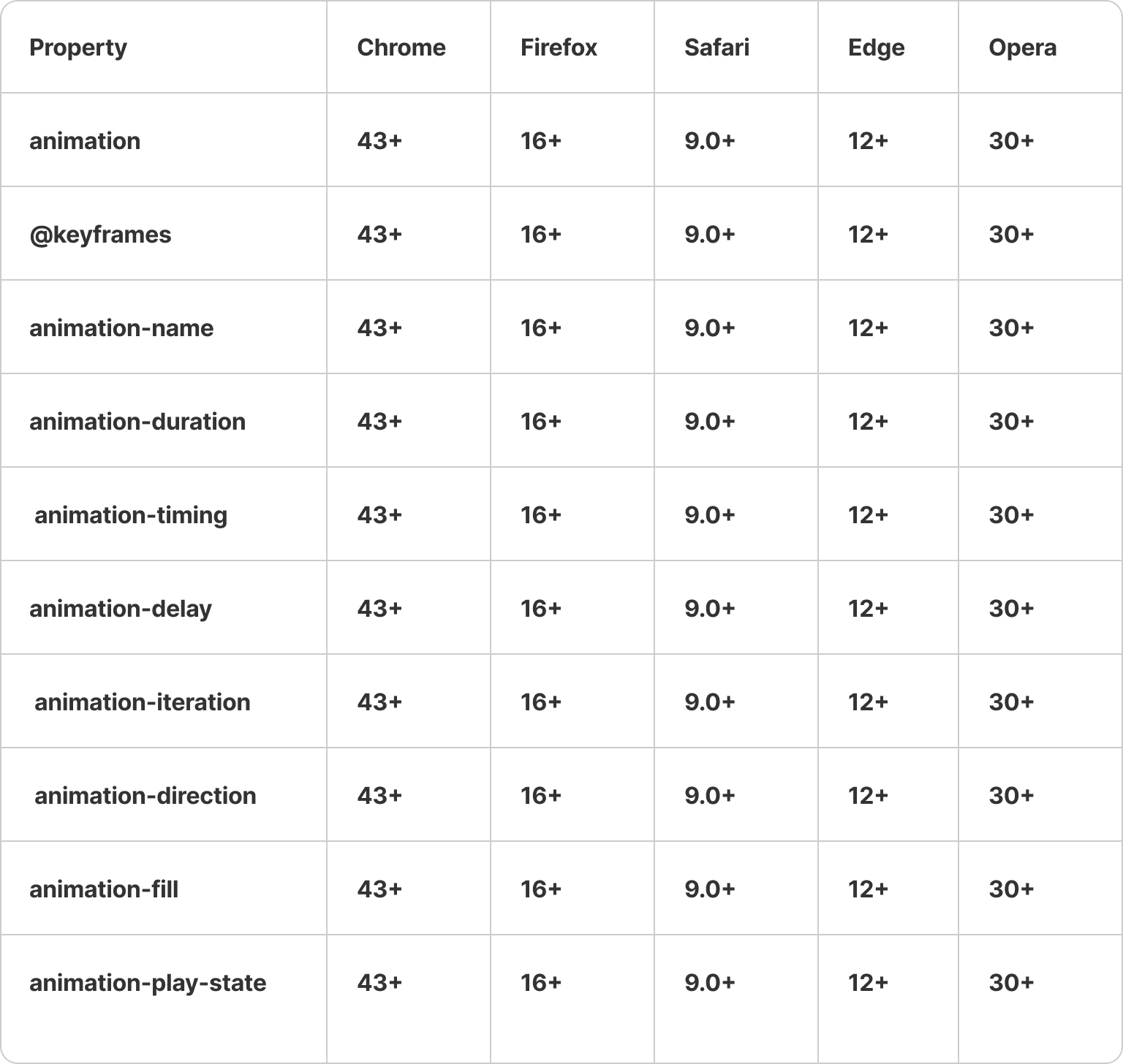
Browser Compatibility for CSS Animation Properties
Up to this point, we've learned quite a bit about CSS animation properties.
However, it's important to note that you can only use CSS animation properties after a specific version in web browsers like Google Chrome, Microsoft Edge, Opera Mini, and others.
These versions are as follows:
And thanks to CSS animations, many websites are adding CSS animations to elevate their websites.
For instance, you can take a look at some of the best websites that have added animations to enhance the user experience, such as Nike-React, KPRVerse, Ventriloc, Heights, and more.
These websites undoubtedly use a variety of animation packages to make their websites highly interactive, like Framer Motion and others.
For swift integration of animations into your application, Locofy.ai offers pre-built effects such as slide-in, fade-in, bounce, and more. Additionally, Locofy.ai enables element tagging as Lottie, allowing for the seamless incorporation and animation of custom Lottie files.
If you want to learn more about how to convert your Figma design to React, React Native, HTML/CSS, Nextjs, Vue, and more, check out our docs. Or explore our solution pages for an in-depth look at how Locofy helps you build apps, websites, portfolio pages and responsive prototypes effortlessly using our low-code platform with seamless AI code generation.
Join the discord server for more updates, and try our sample projects on Figma to experience Lightning.